After almost 11 years of marriage, we are slowly starting to get rid of our hand me down furniture and making our home how we want it (okay a lot me- as Eric is great and just goes with my crazy ideas)
So I will show you the room now and tell you some of the ideas I was thinking.
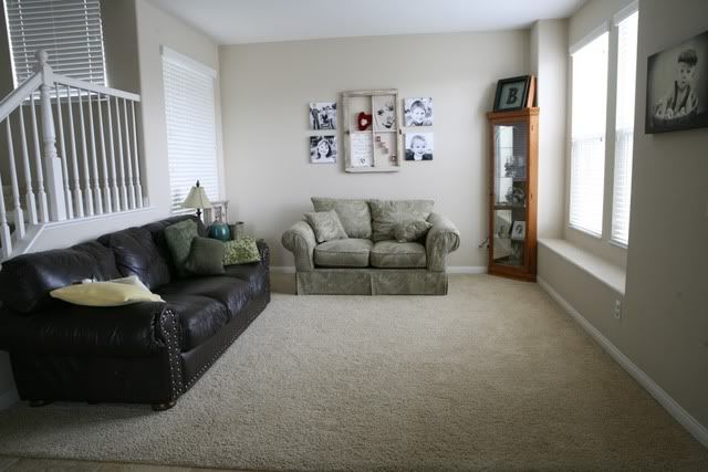 Here is our living room. It isn't really big- 12' X 11' 6"
These are the pieces I am thinking of getting rid of
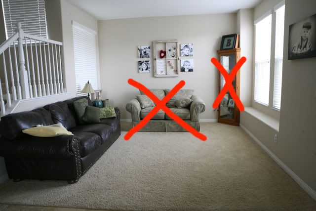 I love love my window and want the new look to showcase that well.
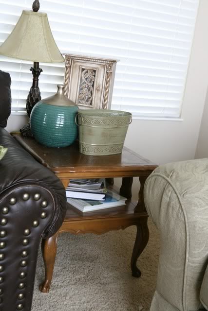
I have this table that can be painted/redone- I am not afraid of painting furniture- or I might just get rid of it.
 Painting the walls isn't an option (we are renting- we move a lot) and I want everything to be portable and things I can take with
 My idea is to get a couple of chairs and a decorative side table sort of thing-no idea what to call it. I want to keep the couch and have at least two chairs so we don't lose any seating. The furniture can be rearranged, however there aren't too many placement options as there are the stairs and the window seat.
 Here are some of the rooms/pieces I have saved in the Houzz App-- for an idea of what I like.
Browse Kitchen Products on Houzz- For Example:
You can click on the arrow to see the different images- the captions were my own thoughts when I saved the item.-- though I am not liking the floral chairs in the blue room as much anymore.
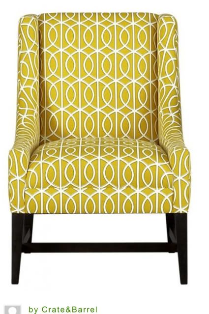
I am coveting The Chloe from Crate and Barrel-- but with little kids and my budget, I am not about to spend $900 on a chair (if anyone can find a cheap knock off of the Chloe I will love you forever!)
I found these from Target at $150-$200 each which are much more budget friendly- I love the cut of the chair- but am not 100% wild about the pattern (might be because I can't get the Chloe out of my head)
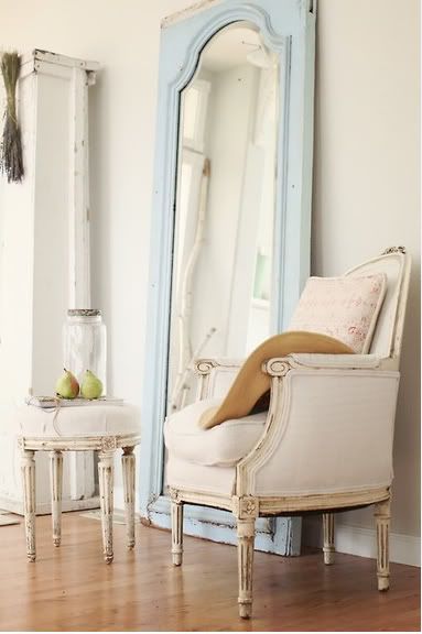
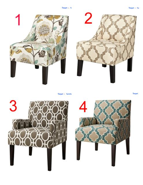 And here are a few other looks I like
I can't decide if two pop chairs would be too much-- thinking maybe so? So I could go with a pop and a more neutral. I am okay with mixing older and newer styles- as long as it works-- I kind of like that look.
Table Pieces
So my question here is what size table piece works with different chairs-- I like pieces like this
Or even really one like I saw at Tai Pan
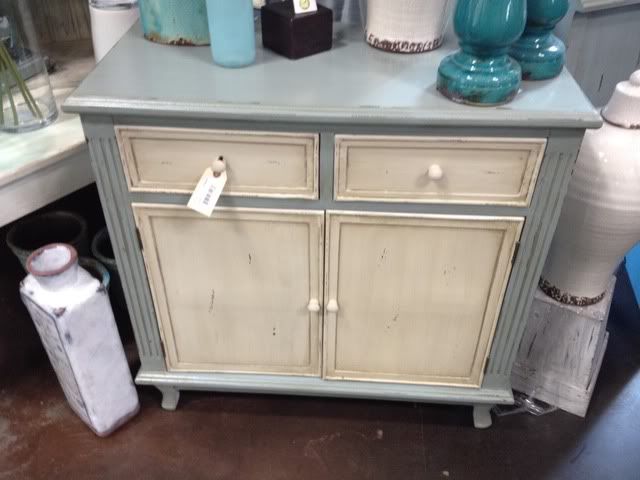 But would that be too big for the space?? Or like that skinny colorful I have in the slideshow above. Or I could change the whole layout around- here are a couple of different ideas
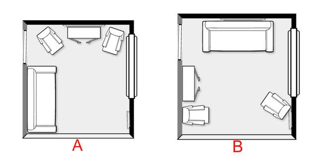 The table piece could go under my antique window which is approx 25" wide- with the pictures the whole display is 58"-- or over by the stair rails. Just looking at the floor plans I think I like option B better- but the front door is right to the left of the outside chair and with the open stair rails it might look weird if I have things on the table piece??
The pop colors I would like to stick with are blue, green and yellow, or even browns.
So here is where you come in. Leave comments with any ideas, links, whatever you can find. I am seriously up for any and every idea-- just within a real budget of course. If you want to go above and beyond create a pinterest board for Emmy Mom's living room-- or just tag me in any pins your find- you can follow me here -- that would be awesome!!
Thank you in advance for any help you give- even if it just saying I hate it all start over. Okay, obviously I don't really want you to say that.
And of course I will show you all the finished product whenever I get it all figured out.



I am horrible at decorating lol I have to enlist my sister in law to get things just perfect for me.
ReplyDeleteI do love chair #3 and that blue chair under it. That table you saw at Tia Pan is gorgeous.
I like "b" design better too...can you have both chairs at an angle facing towards the couch? And I think pops of color would look great with the white walls.
ReplyDeleteHave fun decorating!! Can't wait to see what you come up with
Oh goodness I wish I was more help and hopefully you will have some good suggestions. I do love the bright colored chairs though! I think I like the design "a" better b/c it leaves it so open. Good luck!
ReplyDeleteB design is better, but what about a piece that is padded and can make a nice place to long and enjoy the sun n read a book? Not sure if I was helpful or added to the issue...
ReplyDeleteI prefer design B personally. And I love the little stair landing type thing you've got behind your sofa (my way with words astounds me!) However, you've caused a little argument in my household tis afternoon as I now want a new chair like these ones... ;)
ReplyDeleteI can not give advice without actually being in the room . . . part of being super visual...I am sure it will be great though!
ReplyDeleteYou totally need to talk to my friend Heidi at Budgetwisehome.com. She actually decorates for people and her website is full of great tips.
ReplyDeleteI think chair two and three would both look great paired with a solid pop color chair. Do you live close to IKEA? They have good chairs too? It's going to look great!
ReplyDeletei am a huge fan of the vintage furniture look, so anything you pick in that realm i'm for! also, i love using corners to make a room more full. i vote to get rid of the coffee table or paint it. i love the chairs with patterns. makes a room exciting!
ReplyDeleteHow fun! Since this is a more formal room where conversation is important what about putting your two chairs and end table directly across from the couch so as you look into your room you are looking at the back of your furniture? Of course you would need to put a small table/shelf piece on the wall the stairs is on.
ReplyDeleteOkay, I'll tell you this: I like A or B.
ReplyDeleteI'm horrible at this.
I love a good print on a chair! I like option B better, but I would angle the chair that's sitting over by your stairs so that it's kind of facing the couch. It looks more conversational that way.
ReplyDeleteYou have good taste and not only that, an eye for a bargain. Given time you will be able to make your living room what you want. I wish I knew how to do stuff like that. Good luck!!!
ReplyDeleteI'm no decorator but I do like A option's look!
ReplyDeleteI love how you X'd out those pieces you want to get rid of. You are too funny!
I am firmly an A fan. I like the two pop chairs. Love the Crate and Barrel one, but agree you should pay that much right now. Pick one of the Target chairs in the brown and white and then get a bold yellow pillow. You could do easy yellow/brown/blue drapes for not a lot of money and big impact to draw attention to the window. New pillows on the leather couch and voila. You could paint the side table a dark brown or bright blue and use that in between the two accent chairs.
ReplyDeleteNow I'm just babbling. Ikea is my source for all this sort of stuff. Is there one near you?
LOVE the target chairs! I have looked at them myself! I really like the cabinet choice. Very nice!
ReplyDeleteI like the plan A only because it seems symmetrical in my brain. Although, would putting the couch on the edge of the carpet and tile? You get me??? Ummmm is it too long to put that way? I mean that would make it more "closed off" and feel like a more intament space. However you may like the open feel, just a suggestion.
Can't wait to see what you do with it!
I am doing much the same thing with my living room.
ReplyDeleteAnd I LOVE those chairs from Target especially the flower one and I LOVE the price.
So thanks for finding those for me. :-)
i have no eye for decorating
ReplyDeleteB is easily my favorite. The room will feel bigger and different since you are moving the biggest piece, the couch, to another way.
ReplyDeleteHonestly, I'm not a huge fan of single seats, but the ones you picked are adorable. Me, I want a big comfy chair and fat ottoman to snuggle with the kids in :)
I just reply to your comments on your blog hope thats okay...
ReplyDeleteIts funny you say I have my grandmother's eyes...because her mother's eyes look even more like me and my mom so I guess I mean it is super genetic then! :-) Yah...my parents were married in the 80s...but I am the oldest too...are you the oldest?
OK I am going to be the WAY different person here.
ReplyDeleteI like layout "B" better. Much better, more interesting look.
However, I would get more of an oversized chair and put it by the window (not a love seat but one in between a chair size and a loveseat size). This way you have more seating and it won't cover up your whole window seat/window area. Also, an oversized chair makes a great snuggle chair for you and the hubby!
I would also get another single chair like one of the ones you showed above and maybe one of those big square ottomans that is leather or leather look. This can be moved around and used as a table, a foot rest or more seating. Many also open so they can also be storage.
Have fun!
Oh dear. This is much beyond my level! I can't wait to see the finished product though! I love those chairs!
ReplyDeleteMy favorite is that Tia Pan set. I won't even attempt to give you suggestions because I am the worse when it comes to creativity in things like these. I just like to copy other peoples ideas when it comes to decorating. By the way, I love your living room. It's so clean.
ReplyDeleteI would also hang curtains by the sides of the window, all the way up to the ceiling, to soften the edges, matching the wall color approximately, or in white.
ReplyDeleteSofa on the long wall, rug in front of it in complementary colors, two chairs flanking sofa and facing each other, but angled slightly so it's not a 'box'. Large piece of art on end wall, or a tv, etc. One big piece or a number of photos well arranged. Small table in front of the window with accent piece or lamp for night light.
ReplyDeleteAnd get one of the less expensive chairs and have someone make you a slipcover, or get a plain one and stencil a design on with fabric paints that are washable, wash before painting and after.
ReplyDeleteI am not good at any type of decorating, so I'll leave you with a blog. Her family recently moved in to a new home and they've been decorating a ton!
ReplyDeletehttp://blog.jcooperphotography.com/
I got nothin'. I am sooo not good at this sort of stuff.
ReplyDeleteAlthough I like to look at interior design magazines and pretend that I am.
This is so outside my area, but I would still want the couch across from the window because like you said, you love the window so you'd want to maximize the view from your comfiest seating spot, right?
ReplyDeleteThis comment has been removed by the author.
ReplyDeleteThis comment has been removed by the author.
ReplyDeleteChair For Gamers is most comfortable when you play game in computer. you can not get any pain to your born. I use this chair . And feel comfortable when i sit this chair.
ReplyDelete